TVLens had no logo until today. The navigation bar spelled the name out in two halves and called it a wordmark.
TVLens finds new shows for you through the people who make the shows you already love: the writers, directors and actors behind them.
Our logo is built around that idea.
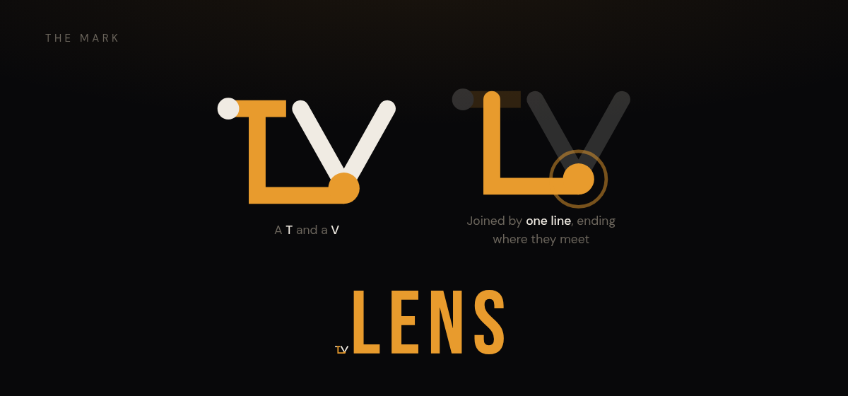
The T and the V are joined by a single line. It starts at the top of the T, runs down and across the bottom, and ends at the tip of the V.
Think of each letter as a show, and the line as a person who worked on both. The amber dot at the tip of the V is where they meet.
That’s how TVLens works. One person connects two shows, and that connection is often why you’ll like the next one.
The line is not only an actor. TVLens ranks cast and crew on one list, weighted by how much of a show each person actually made, so the line between two shows might be a lead who appeared in all sixty-two episodes or a director who shot nine of them. The mark stands for the whole relationship: a show, the people in front of the camera, and the people behind it.
Two colors, both already in the palette. Adding a brand color to draw the brand mark would have broken the rule the mark exists to represent.
I think the logo is pretty cool.
For a more in-depth explanation, read this ADR.